ShopDreamUp AI ArtDreamUp
Deviation Actions


Suggested Deviants


Suggested Collections


You Might Like…


Description
Random.
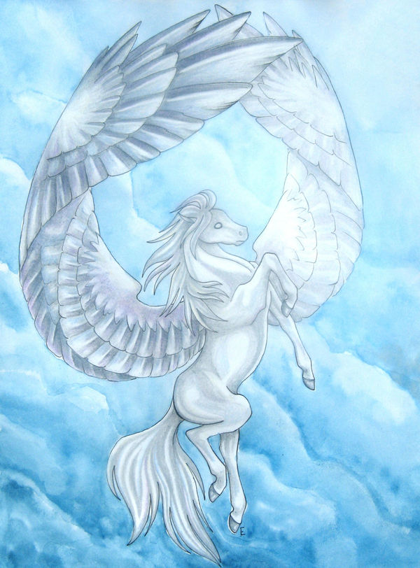
This is actually a picture I had to take because my scanner absolutly destroyed the colour. It turned out great in real life. I enjoy doing these backgrounds, maybe I should actually do them on watercolour paper though so I won't have to iron it and shove it between books to try and get it flat again... I couldn't get the far wing right for the life of me.
Tools: micron pen, prismacolour pencils, white gel pen, watercolours
Image (c) to Emily Danielisz
Image size
1973x2668px 9.64 MB
© 2009 - 2024 emmily-xo
Comments89
Join the community to add your comment. Already a deviant? Log In
I never quite know how to rate people with the stars system, so I've opted to give you 5 stars on everything <img src="e.deviantart.net/emoticons/s/s…" width="15" height="15" alt="
It's truly a lovely, striking image. I'm so used to your images having really strong figures with little or no background. To see this with such lovely glowing clouds is really something else. I would love to see more watercolor backgrounds from you, as you seem to have a good level of control (certainly no easy feat with watercolor). The figure itself seems so otherworldly, so divine. There is a lot of majesty and grace embedded in the equine form and you've definitely captured that.
Your shading seems to get better and better with each piece you upload. I don't always find time to comment, but I've seen tremendous growth from you since I started watching you. I feel that this image is a prime example of that.
There are only two things I'd like to address, and they are pretty minor <img src="e.deviantart.net/emoticons/s/s…" width="15" height="15" alt="
The second thing I want to address is the hind leg that is closest to the viewer. It looks like there is a lump close to the belly. I'm not sure if that was intentional or not, but I find my eye drawn to that as it travels down the image.
Again, kudos for this. I don't often give advanced critique, so I apologize for the word overload <img src="e.deviantart.net/emoticons/a/a…" width="19" height="19" alt="